|
I finished my booklet project and I'm a bit torn as to what to think of them. I designed them with a specific size in mind and they came out a lot bigger than I expected. Like, twice as big. I'm sure that was a problem on my end, not my printer's but it is what it is. The cover of my Two Years Before The Mast booklet had an image of a ship on it and when it printed, a thin line bordered the top edge of the graphic box. That was on the part of the printer, which is pretty frustrating. Overall I'm indifferent with the final project. If I were to do it again I would print and bind the booklets myself. If I had done that I would have caught my sizing mistake and changed it. I also would have fixed the weird line on my Mast booklet cover. 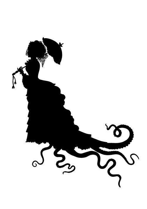
1 Comment
In my previous post I introduced my booklet project; I'm making three twenty-four-page booklets. The books I will be making these from are Two Years Before The Mast, The Sea Bride and The Adventures of Captain Horn. As is stands, I think I'll use a plain white paper for the bodies of the booklets and dark-colored cover paper for the covers. There are some leftover cover-paper sheets that I can use for free, so I'll probably just choose from those. For a typeface I think I'll use some variation of Baskerville. As for binding I'm planning on experimenting with French folds. If that doesn't work I'll choose a simple method like saddle stitch or something. If I do go with a French fold I will make cut-out images on the covers. 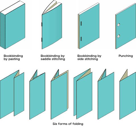 photo credit of https://mumcreativityforestacademy.wordpress.com
Our next assignment in this class is to choose a two-page spread from a magazine and remake it on InDesign. I scanned an image of the spread and placed into a new document. I need to remake the elements of the page on top of the image in a separate layer of the document. That is rather interesting because I needed to identify the typeface used in the original spread and that is actually more difficult than I thought.
Our final project for this class is to choose a series of three books in the public domain and design layouts for 24 pages of the book's text. The books I have chosen are: The Sea Bride, The Adventures of Captain Horn, and Two Years Before the Mast. I wanted to go for a pirate theme. I think I'm going to use emerald paper for the covers and coral paper for the insides. The next assignment after the letterform was to make a series of three typographic poster. Following my geeky theme I chose to make my poster based on the Portal series. This project was very challenging but I learned quite a bit. 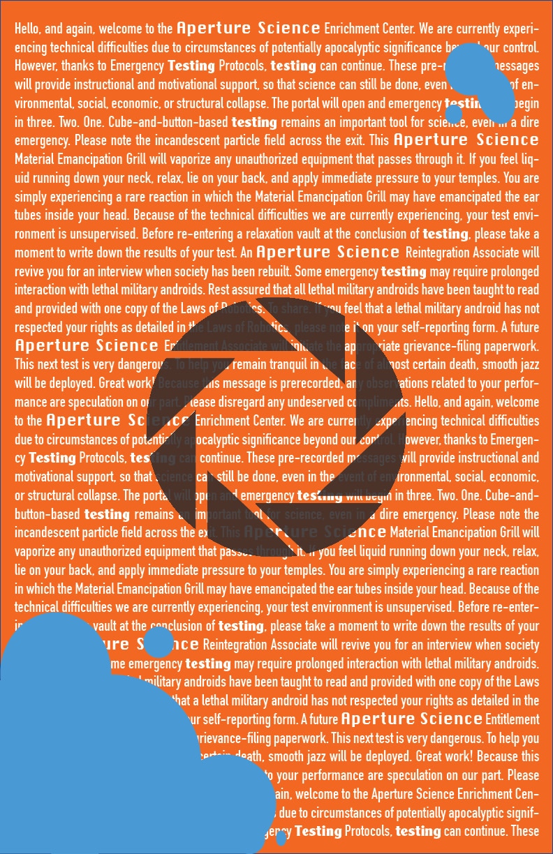 This was actually the last poster I made, but It sums up the series well, so we'll start with it. This poster is based on the Portal 2 test-chamber announcer voice lines. I chose to use the lines from the beginning of the game and then just repeat them until the page was full of text. This represents the continuous stream of dialogue that kind of assaults the player at the start of the game. The middle symbol is the Aperture Laboratories logo image. The blue is meant to look like the repulsion gel that is introduced in Portal 2. It also adds a break from the visual monotony. This poster is my favorite of the three. 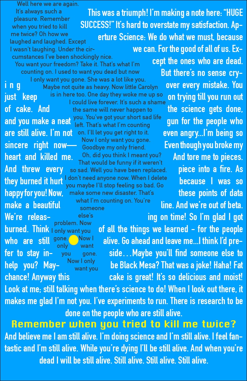 For this poster I decided to focus mainly on GLaDOS, who is my favorite character of the series. The white text is the lyrics of "Still Alive," the end-credit song of the first game . The black text that makes up her shape is the lyrics of Want You Gone, the end-credit song of the second game. 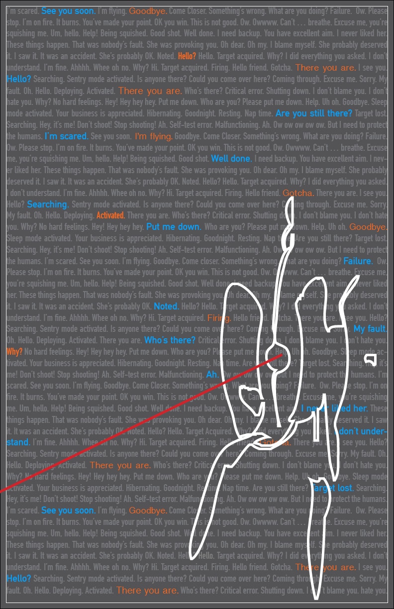 For this last poster I focused on the turrets that appear in both games. I really love how their voice lines are so contradictory and endearing. I wanted to portray that here. This was the poster I struggled with the most, but I do love how it turned out. There are two things that I plan on changing later. First, I want to remove the colored outline that frames the text box; I don't even know how that got there. Second, I want to remove the odd floating object on the right side of the turret. That's just how the outline turned out, and I didn't have time to fix it.
I'm proud of these posters overall, and I'm happy with how much I learned through the process of creating them. A lot has happened since my last post! I finished my project and am super happy with it. After I had the pieces cut out, I sanded the corners with sand paper to get the rounded look of a Kazmann Sans J . It took an hour or so. Then I painted on a layer of white acrylic paint. I then glued the pieces together with Elmer's multi-purpose glue. I ran out of paint so I had to decide whether to leave my J with one coat of paint, or to buy more and make it look cleaner. I ended up buying more paint and covering everything but the back of the letter. All that was left was to take photos to post for a grade. For my first design project, I had to choose a letter in a specific typeface and make a 3D sculpture of it. My favorite video game series, Portal, has an industrial aesthetic, so I started there. I went a J because my favorite word is "jubilation" and Js remind of pipes. After some research, I found Kazmann Sans. I went with this typeface because the capital J looks more like a curvy pipe than a candy cane, which was the problem with most other typefaces I found.  For the material I would use, I chose dry foam. It is easy to cut—I used a large kitchen knife—but it is also fragile; the foam rubs off just by being touched. We'll see if that was a good decision. I had my sister help me get the measurements needed to blow the letter up enough to be at least 10" wide. The final measurements are pictured below. When we had figured out the dimensions, we got the parts of the J drawn down on a scrap piece of tabloid-sized paper (which explains the printed J on it). I cut out the J and traced the lines onto my dry foam with a sharpie marker. I did this on both sides so the cutting process would be easier and the lines would be straight. I used a metal ruler as a straight-edge and to keep to the measurements. I have the main pieces of my J cut out and now I just need to sand down the corners to create the curves and then glue them together. From there, I will either paper mache the foam and then paint it white, or just paint directly on the foam. I'm going to test both strategies on some of my scrap pieces and see what works best.
Updates to come!  Hopefully my design experience will be a beautiful thing that happens in this world. I'm hopeful that it will, and I shan't be afraid! |
AuthorI'm Erica Sundvall; I have many goals and a lot of work to get where I want to be! Archives
March 2017
Categories |


 RSS Feed
